MTS — red, Sberbank — green, pasta — Shebekinsky. And this is not a new children's game "alive — inanimate," but a test for identity. Whose or what? Brands. If a single word triggers associations with a brand and an image immediately forms in your mind, then the company's identity is perfect.
Branding or Identity?
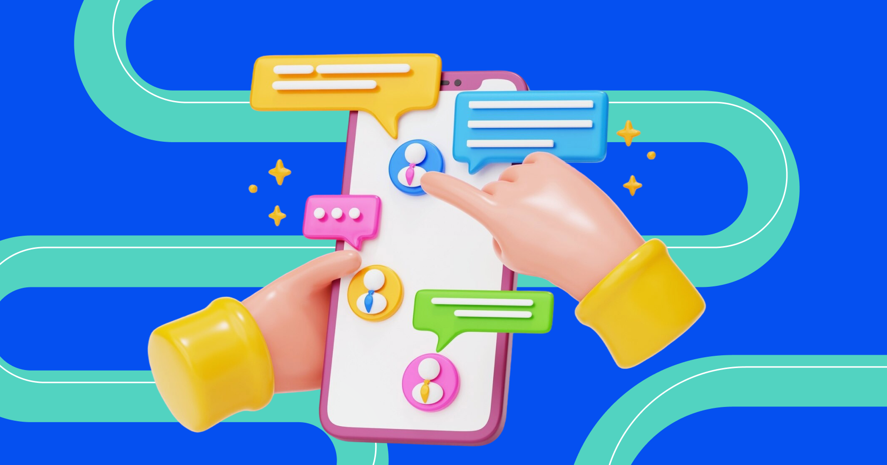
When purchasing a product or service from a certain brand, we also acquire emotions: joy, pleasure, a sense of connection with millions of people who make the same choice. A brand is not only about products but also about a company's philosophy, mission, and values.
Its recognition is accomplished by branding, a whole set of marketing actions that create a positive image of the company. And one of the most powerful tools of branding is identity, thanks to which a brand acquires a corporate style, its own color, voice, and even scent or taste! Identity essentially governs a person's consciousness, evoking pleasant associations and prompting them to purchase a product or service from a certain brand.
How does it work? Sounds, colors, and visual representation of a brand evoke positive emotions from the consumer, who begins to associate themselves with the brand, "adopting" the qualities and values it communicates. Rolex, Porsche, Islay Whiskey — these are watches, a car, and whiskey. But anyone understands that these are status items, a belonging to a community of those who can afford exactly these watches, exactly this car, or whiskey. And identity played a significant role in forming this image.
What is Identity, Why It Is Needed
Identity (from English — identity) is a set of unique elements for each brand that make it recognizable. Identity is the corporate style of a brand, its taste, scent, idea it conveys. Each element should trigger a whole associative series just by mentioning the brand. You hear "The holiday is coming to us!" — and immediately you taste the bubbles and drink on your tongue, hear the ringing of Christmas bells, and feel the moist weight of the bottle. Identity is about individuality.
Identity is necessary to:
- declare one's values, ideas, mission
- make the product unique and recognizable,
- increase the number of loyal customers
- boost sales volumes
- encourage customers towards more activity
- stand out among competitors while distancing from them
- a way of interacting with customers
And all of this for the success of the business, popularity, profit.
How Identity and Corporate Style Differ
At times, it is difficult to distinguish between identity and corporate style. The difference lies in the scale of concepts: corporate style is a small part of identity, whereas the latter also includes the company's mission, philosophy and positioning, the overall market and business strategy.
Corporate style is about a beautiful picture and design. It includes colors, fonts, graphical elements (logo, pattern), methods of combining objects with each other.
How Does Identity Affect Us?
With its help, an impact is achieved on all the senses — sight, hearing, smell, touch, and taste, because each of them creates its impression about an image, and together they multiply each other many times. Not every product can afford all five helpers at once, so the possibilities limit each product.
### Sight Most people on the planet are visually oriented, so visual images affect us the most. Visual identity includes all visible elements.
So, for each of us, it is enough to take one glance at the outlines of letters, color, symbols not just to understand what product or service the brand offers, but also what mood is created, whether it can be trusted, and much more. Each element of visual identity brings specific meanings. Let's take a closer look at some of these elements.
Font can influence the consumer's mood. So, straight and elongated fonts are universal, creating a neutral-business mood. Strict square fonts tune to seriousness and authority, while rounded ones suggest comfort, coziness, and goodness. Handwritten fonts emphasize the exclusivity of the product or service, and stylized decorative ones are very original, but their use is limited to specific themes.
Color — it is proven that most people associate particular colors uniformly.
- For example, red attracts attention and encourages action, associating with warmth, confidence, power, energy. Brands using it include PUMA, YouTube, Bugatti, Magnit, MTS.
- Orange also attracts attention; it's youthful, brings joy, inspires, energizes, instills boldness and energy. It's found in Xiaomi, DNS, Dixie, Firefox.
- Yellow incites action too but does so more gently. It's a cheerful and playful color, lively, optimistic, and logical. It also reminds of gold. Probably why brands like Yandex, Tinkoff, Burger King, Shell chose it.
- Green is considered universal. It associates with freshness, life, renewal, harmony, reliability, friendliness, and eco-friendliness. It's seen at Sberbank, Vkusvill, Fairy, TicTac.
- Blue is a favorite color for both men and women. It associates with calmness, honesty, striving for perfection, reliability, soothes, and reduces anxiety. Probably why many social networks choose shades of blue: they set up for a tactful conversation. And its sense of ease is loved by airlines. It's seen with brands like Gazprom, Ford, Visa, P&G, as well as Telegram and VK.
- White is often used as a background color: it amplifies the effect of other colors. And paired with black, often associated with mystery, it's often used by expensive brands. For example, Gucci, Victoria’s Secret, Lancome, IBM.
Name must be written uniquely to stand out.
Logo usually performed in corporate colors. Sharp angles convey the feeling of a company's stability and reliability, circles and ovals — comfort and care, vertical lines — boldness and masculinity, horizontal — tenderness and tranquility.
Other elements: mascot, patterns, textures, icons, illustrations, photographs.

While we mostly relate to visual images, the auditory components of identity work more than effectively, forming a rigid tandem with its visual part. Everyone knows the playful words "Red Bull Gives You Wings" from Red Bull, and immediately, the blue and white can of drink appears before one's eyes, along with the crisp "pssshhh" from Pepsi or the familiar "Sber. Always there!" and we see the green tick of Sber. All of these are jingles — short musical phrases often originating from slogans, often conveying the company's mission. Adding to this is the music and sounds in commercials.
Smell
The visual association based on scent is another tool of identity. However, this way to differentiate using aroma is rarely used, often applicable only in the premium segment: it suits not all products and is expensive to implement. Aroma is loved by respectable car and footwear showrooms, luxury hotels, spas, jewelry chains, and shopping centers.
Touch
The tactile brand image is created mainly by materials from which the corporate packaging, business cards, document forms, letters are made. Some companies integrate sensory sensations directly into their product, like Stabilo, which developed a lightweight, conical, and compact marker. The tactically pleasing surface and how the marker comfortably fits in the hand evoke exclusively pleasant associations, significantly increasing the likelihood that a buyer will return for the same product! Others use promotional gifts.
Taste
The representation of a company through taste anchors in memory is a rare case, but this method is also used. IKEA with its signature Swedish meatballs with sweet sauce.
Main Components of Identity
The basic elements of identity are few: name, logo, font, color. Most companies do not go beyond this set not only at the start but throughout their history.
 Photographer: Eva Bronzini: https://www.pexels.com/photo/7661590/
Name
It always reflects the philosophy, mood, uniqueness, spirit of the brand. Great brands have seemingly simple names. But genius is always complicated simplicity. Therefore, various methods are used to create a unique, concise, and sonorous name: combining words (Adidas — the creator of this brand was Adolf Dassler, and among friends and acquaintances, he was known as Adi, Adi Das), using parts of words by moving them between each other (Lego originated from the Danish "godt leg," which translates as "good play"), and many other techniques.
Logo
The visual embodiment of a company in the form of a small concise picture. It's not always presented as a name; often, we see only a graphical depiction. Apple, McDonald’s, Nike, Mickey Mouse — examples of successful logos without a single letter inside. The logo, like the name, is very challenging because the essence of the brand and its product must be expressed in a small symbol.

Photographer: Jess Bailey Designs: https://www.pexels.com/photo/iphone-x-airpods-788946/### Font
The font is intended to create a unified, complete image. A company might not have a logo, but they will definitely face the need to choose a font because names don't exist without their graphic design. The font must be easy to read and not pose puzzles to consumers. It creates the atmosphere and mood of the brand; people easily subconsciously perceive these semantic meanings. Gucci's font conveys the luxury and impeccable quality of the brand, Nike's font is bold and dynamic, demonstrating the drive of this brand. The classic font Mercedes conveys feelings of stability, classicism, success to the buyer.
Color
Completes the set of key identity elements. Color deeply impacts the subconscious, emotions, and associations of a person with the company, just like smell and visual images. Each color has its established meaning, and this needs to be understood when choosing it so as not to inadvertently lose part of the audience.
When choosing a color for identity, consider not only the first association but also the country or culture where the brand operates. For instance, in Russia and Western countries, white is purity, whereas in Japan, it's the color of mourning.
Color is a powerful product identifier: we may not see or be able to read the name, but we easily find the right product by its palette alone.
Slogan
Some companies add a slogan to the standard set of basic identity elements. A successfully crafted phrase firmly connects with the product, insistently spinning in people's heads over and over, evoking the familiar image, and sometimes the consumer needs nothing else for a purchase, just to hear the melodic phrase. Famous "Maybe it's Maybelline" from Maybelline, "I'm lovin' it" from McDonald’s, "Impossible is nothing" from Adidas encourage action.
Static and Dynamic Identity
Dynamic Identity adapts to the situation and allows the product to be tailored for different platforms. Remember Google's home page on a holiday — instead of the usual logo, we see an animated picture. Or MTS, which boldly plays with icons for different types of services, but form and color remain familiar, keeping the brand recognizable. Another example is the MTV logo; over the years, only the shape remains unchanged: a large M and a small tv. However, color, texture, background change constantly.
Dynamic identity is used when a brand has several products or entire ecosystems — Sber, Yandex, Apple, Google.

Static Identity is employed by companies without a huge product line or, for example, monopolists of the sector. In this case, a specific set of elements — the logo, corporate fonts, colors, and their precise combinations — are used. These are updated from time to time only to stay current, but the overall strategy remains unchanged. ## How to Develop Identity
Creating identity can be done independently within the company or entrusted to creative agencies. In both cases, the following steps need to be followed:
Determine Goals
Determine the goal and expectations the visual identity should solve. Suppose the company is entering the market for the first time, striving to capture a new audience, or has acquired qualities distinguishing it from competitors. And it wants to communicate this to the client as an added value. All of this is a manifestation of care for a certain social group, an eco-friendly approach in production.
Identify the Pain Points of Your Target Audience
It's recommended to thoroughly imagine the portrait of your client: their gender, profession, income level, pain points, goals, aspirations. The closer the company looks at the product, services through the customer's eyes, the easier it is to determine directions in image development.
Study the Market
At this stage, you need to understand how competitors with similar products interact with the consumer, what image they have chosen, what offline and online communication rules exist, and how all of this is implemented in identity. Be sure to determine the predominant colors, fonts, shapes, or packaging already used by other manufacturers. A new company needs to fit in but not merge with the existing visual diversity.
Begin Developing Identity
Having defined itself, its role, and its customer, the company proceeds with selecting elements of the corporate style:
- developing a name;
- selecting a font;
- determining color scheme;
- creating a logo, designing the website.
For a start, having only the name and logo is sufficient. Their color and fonts can influence the consumer, creating the desired brand image.
Maintain Identity in Everything
The uniqueness and identity of the brand should be reflected in everything, including social networks. Here, the color scheme, logo, design, brand voice (Tone of voice), content of posts and frequency of their publication matter, along with feedback from subscribers. The Postmypost service for managing social networks handles this well. Prepare posts for publication across different networks in a single editor window, plan the release of one or several posts at any time of any day, respond to messages and comments from the Monitoring section. It's all simple and consistent with your goals!
In Summary
Identity is not a panacea for all companies and brands. Most often, identity is of interest to large brands that need to create their complex system of impact on buyers. A manicure master from social networks or an auto parts store will just create their logo, business card, select colors, and fonts. This will help them stand out in their niche, but in the global sense, they will remain unknown.
When a company wants to be recognized at the level of countries and continents and remain in history, it begins to create its image, character, and style — in a word, its own brand.
Each element of identity carries a certain meaning and is subject to the overall idea of the brand. The more competitors a company has in its niche, the more thought out every part of the identity should be.
Identity is characterized by unity. All its elements not only design-wise, each tells its part of the story about values and mission.