Top.Mail.Ru
用于 Instagram 的漂亮字体:在哪里获取和如何使用 — Postmypost
用于 Instagram 的漂亮字体:在哪里获取和如何使用

用于 Instagram 的漂亮字体:在哪里获取和如何使用

19.02.2024

阅读 1 分钟
洞察
Nikiforov Aleksandr

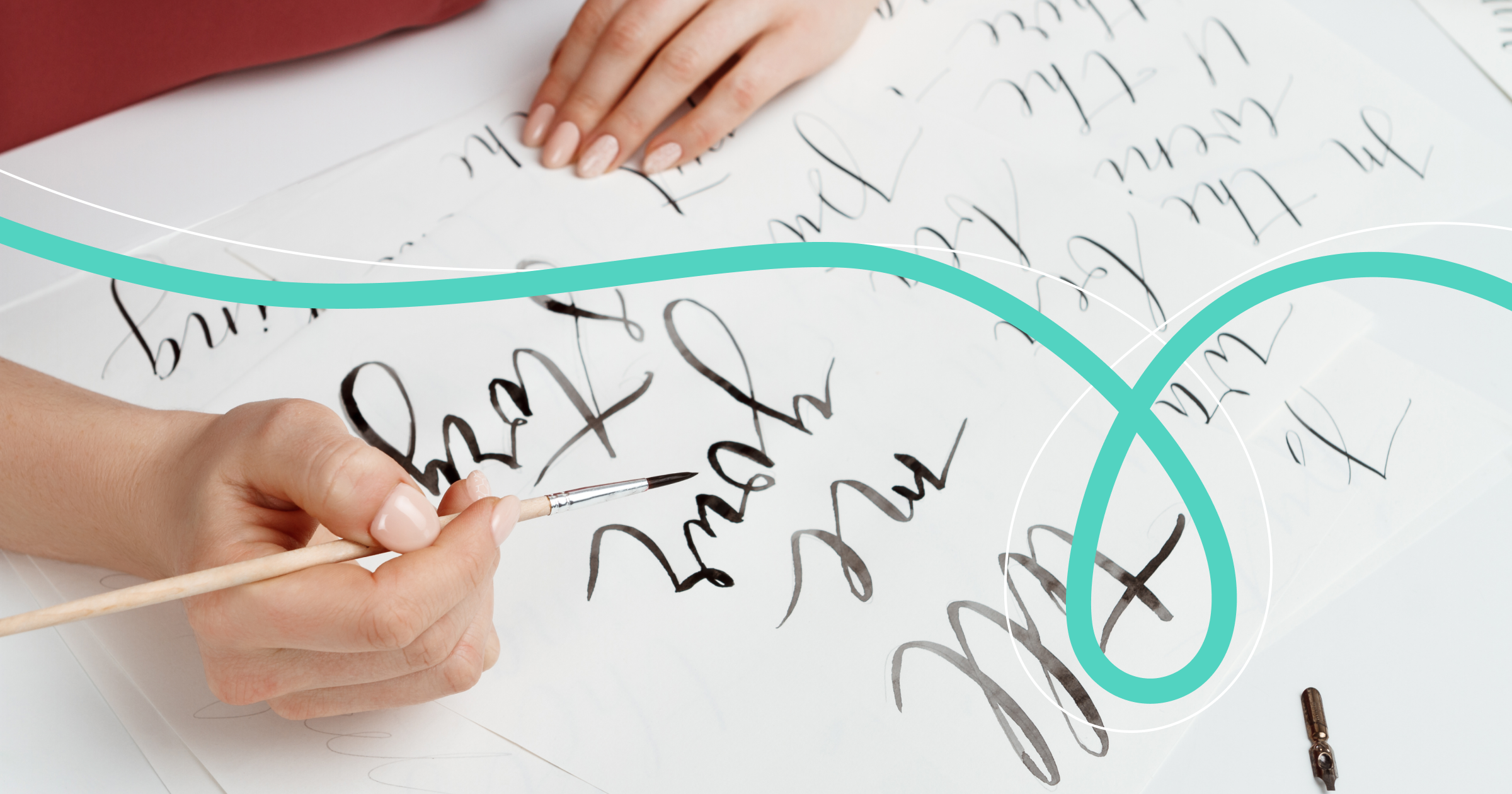
如何让您的博客或商业账户在众多中脱颖而出?如何让Reels或帖子更引人注目?其中一种方法是使用非标准字体。

今天,重要的不仅是帖子中写的内容,还有它的呈现方式。Instagram*中的文字排版扮演着重要角色。为了在视觉上丰富文本,可以使用表情符号、贴纸,还可以使用各种字体。它们将突出文本,并强调细节。关键是要明智地使用这些字体。

如何在Instagram*上使用字体

非标准字体可以添加到Stories、个人资料标题、发布文本、描述和IGTV标题中。

这样,用替代字体突出的标题比用标准字体或粗体书写的标题更能吸引注意力。这也适用于作者在邀请用户探讨某个话题或分享看法时提问的问题。

用特别字体书写的用户名或品牌名也会吸引受众的注意。

然而,这些字体在Stories中看起来最有趣。顺便说一下,这里已经有9种字体可选,可以选择其中任何一种。

要正确搭配字体,需要记住几个重要规则:

  • 标题比文本重要。因此,总是通过背景或较大的字体来加以突出。
  • 不要将创意字体用于正文。
  • 为了确保两种字体在一段文字中搭配得当,请使用验证过的组合:现代+创意,双重阴影+杂志,经典+经典衬线,创意+霓虹。

在Stories中使用哪些字体

在Stories的文本中可以选择9种字体之一。点击“Аа”按钮并选择您需要的字体。

经典字体

这是第一个字体。可以为文本添加背景,以防在色彩缤纷的照片中消失。该字体在任何照片或视频上看起来都很不错。

现代字体

这款字体允许更改颜色和背景,只需多次点击上面的第二个和第三个按钮即可。字体完美适合用于标题。

霓虹字体

这种字体最好用于写标题或非常简短的文本,以免分散粉丝的注意。

印刷字体

非常适合在照片或背景中添加大量文本的人。这种字体既方便又易于阅读。该字体有两个背景,可以为文字中的任何单词着色。

双重阴影字体

一种流行的字体,允许用“倾斜”的方式书写文本,并添加轮廓的柔和双重阴影。最好将其用于标题或简短的句子。用这种字体书写的大段文字很难理解。

创意字体

用西里尔字母写的字母看起来粗糙,而用拉丁字母写的则类似于Comic Sans。底层类似于画在画布上的刷子触感。

杂志字体

文字底部有背景和描边。与其他字体一样,可以选择字母颜色。最适合用于写标题或短句。

通用大写字体

与其他字体不同,它具有圆形边缘和密集的背景,可以完全覆盖任何图像。这种文字非常适合用于明亮的插入。

经典衬线字体

一种整洁的经典字体,可用于写作较长的Stories。用此字体书写的文字易于阅读。然而最好在简单的单色背景上使用,否则字母可能会“丢失”。

在哪里还能找到不寻常的字体?

可以通过特殊网站、应用程序和机器人用漂亮的字母写文本。关键要记住:字体越非标准化,Instagram*按用户请求翻译成其他语言的可能性就越小。

网上有很多资源可以帮助您美化文本。以下是其中的一些。

Fine Words

Fine Words上的字体既漂亮又免费。选择任何一种,编写文本,然后复制并粘贴到Instagram*。

IGFonts.io

免费的IGFonts.io网站提供了许多拉丁字母风格的选项,还有俄文字体的不同下划线选项。

Piliapp

在线服务Piliapp也提供漂亮的字体。输入文本,即可获得用不寻常字母书写的文本。

HypeType

在服务HypeType顶部输入文本,然后选择您最喜欢的书写方式。

选择不寻常的字体时,请记住最重要的一点:它们应该合适,并与您叠加的照片或视频相吻合。祝您发帖有趣,Stories精彩!

* 该社交网络在俄罗斯被认定为极端主义并被禁止。


相关文章

所有文章
Roles in the team: how to distribute work and avoid task duplication in SMM

Roles in the team: how to distribute work and avoid task duplication in SMM

17.04.2026

阅读 5 分钟
洞察

In a small team, everything still relies on enthusiasm and "everyone understands each other." But as soon as the project gains 3–7 people, enthusiasm...

Nikiforov Aleksandr
Beautiful fonts of 2026 - where to download for free and how to use in design

Beautiful fonts of 2026 - where to download for free and how to use in design

16.04.2026

阅读 5 分钟
洞察

In 2026, typography remains one of the main tools that helps to stand out a post in the feed and convey the brand's mood in seconds. The right font ma...

Nikiforov Aleksandr
Content Calendar: How to Stop Remembering Posts at the Last Minute

Content Calendar: How to Stop Remembering Posts at the Last Minute

09.04.2026

阅读 5 分钟
洞察

Imagine a Monday morning. You open your phone, and a thought crosses your mind: "I was supposed to post today!" You frantically search for a ready tex...

Nikiforov Aleksandr
7-day challenge: launching an SMM project from scratch in 2026

7-day challenge: launching an SMM project from scratch in 2026

06.04.2026

阅读 5 分钟
洞察

The year 2026 is when social media algorithms became even smarter, and the audience demands not just content, but a system that operates on autopilot....

Nikiforov Aleksandr
Updating SMM tools in 2026: what can really speed up team performance

Updating SMM tools in 2026: what can really speed up team performance

06.04.2026

阅读 5 分钟
洞察

In 2026, SMM is no longer about “posting once a day and waiting for likes.” Teams are managing dozens of accounts, hundreds of comments daily, and fac...

Nikiforov Aleksandr
Vertical Video 2026: Safe Zones, Text, and Editing — How to Create Content That Doesn't Cut Through Algorithms

Vertical Video 2026: Safe Zones, Text, and Editing — How to Create Content That Doesn't Cut Through Algorithms

03.04.2026

阅读 4 分钟
洞察

In 2026, vertical video remains the primary driver of reach on Reels, VK Clips, YouTube Shorts, TikTok, and RuTube Shorts. The algorithms of these pla...

Nikiforov Aleksandr
所有文章